Nice Try, Fox
I love Fox News charts, especially this one.
Customer Brian sent us another one:
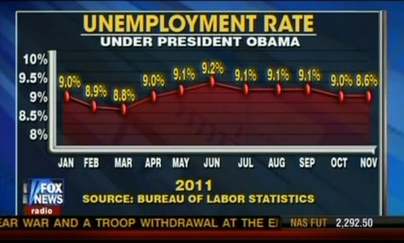
Okay, notice that the drop between October and November is the largest change but the line stays the same. The 8.6% is the lowest number but the chart shows that it’s the same as 9.0%.
Personally, I’m wondering how that chart would look if the title was “Unemployment Rate Under The Republican Controlled Congress.”
And Fox News viewers are surprised that they are dumb as fried dirt.
