I Honestly Don’t Know
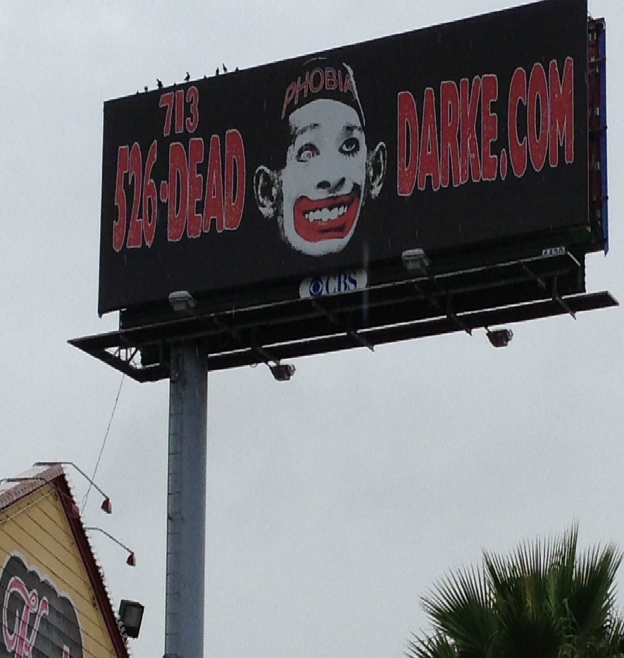
Maybe we Democrats are getting a little too touchy. Maybe Republicans are just jerks. But, for the life of me, I don’t know if this sign is godawful or I’m just getting too old.
Sign on 6 near Briarforest on West Side of Houston
I know it’s an advertisement for a haunted house but isn’t kind of a strange image? Dead darke? Really?
Maybe the guy standing in my driveway screaming the N word at my Obama banner just made me weird.

Amiga, I think that doesn’t have anything to do with your political affiliation, it’s more the effect of wisdom and good taste! The children get stranger and stranger, but that’s the same as it ever was, I think: Cicero was deploring it in Rome before Sweet Jesus arrived the first time! 😉
1I don’t think you are being over sensitive. I went and took a brief look at their website. No images like that on their home page. It is a very poor billboard, way too cluttered to make it easy to remember the url, which is presumably the whole point of the exercise.
2As a technical writer I learned that rule number one is to format your work so that people can actually read it. Blobby red letters on a black background presented to a driver doesn’t work.
3Rule #1 of heraldry is for contrast: no color on color and no metal on metal. The metals are silver and gold (white/light grey and yellow). Colors are pretty much everything else. So you could have colors next to each other, like a shield divided in half red and blue, but the charge needed to be a metal. Good advertisers use these rules subconsciously for logos, so we have the symbol for Shell Oil, a yellow scallop on a red field, or the Texaco sign, a red T on a white star, which is in turn on a red field. Good contrast can be seen for a long way, which is why you can see that white DQ on the red background and home in on the Dairy Queen when you are travelling.
Looks like they tried to fimbriate (fancy word for outline) the words with a light color for contrast, but it was way too narrow to do the job.
Don’t know if you’re being too sensitive. I’ve seen political cartoons with less resemblance to our President than this Phobia clown.
4I remember that section of 6 — about 10 miles from my old house. Right by George Bush Park.
5Juanita,
Not old or overly sensitive – like me and most here (guessing) we are just DAYUM sick and tired of the disrespectful and racism against the duly elected President of the United States of America (includes 50 states).
O/T but did you just LOVE hearing George Bush’s name said by POTUS last night – that was soooooooooo much fun – Romney = SteroidalDubya
6Yes, white face on a black man, that’s hard to figure out. Here’s another sign with a noose and HANG in there OBAMA written on it, which the guy posting it claims only shows his support for Obama. The woman across the street says she is confused by the mixed message. Really people? A noose as a symbol of support? It’s not a mixed message, it’s a clear message from the bottom of the bell shaped curve: http://www.fox11online.com/dpp/news/local/fox_cities/obama-sign-causes-stir-in-redgranite?hpt=us_bn9
7