Keeping You Informed
Guess who has a new campaign tee-shirt and logo …
Hint: it’s not Clark Kent.
Thank to Peg for the heads up.
February 28, 2015 By: Juanita Jean Herownself Category: Uncategorized
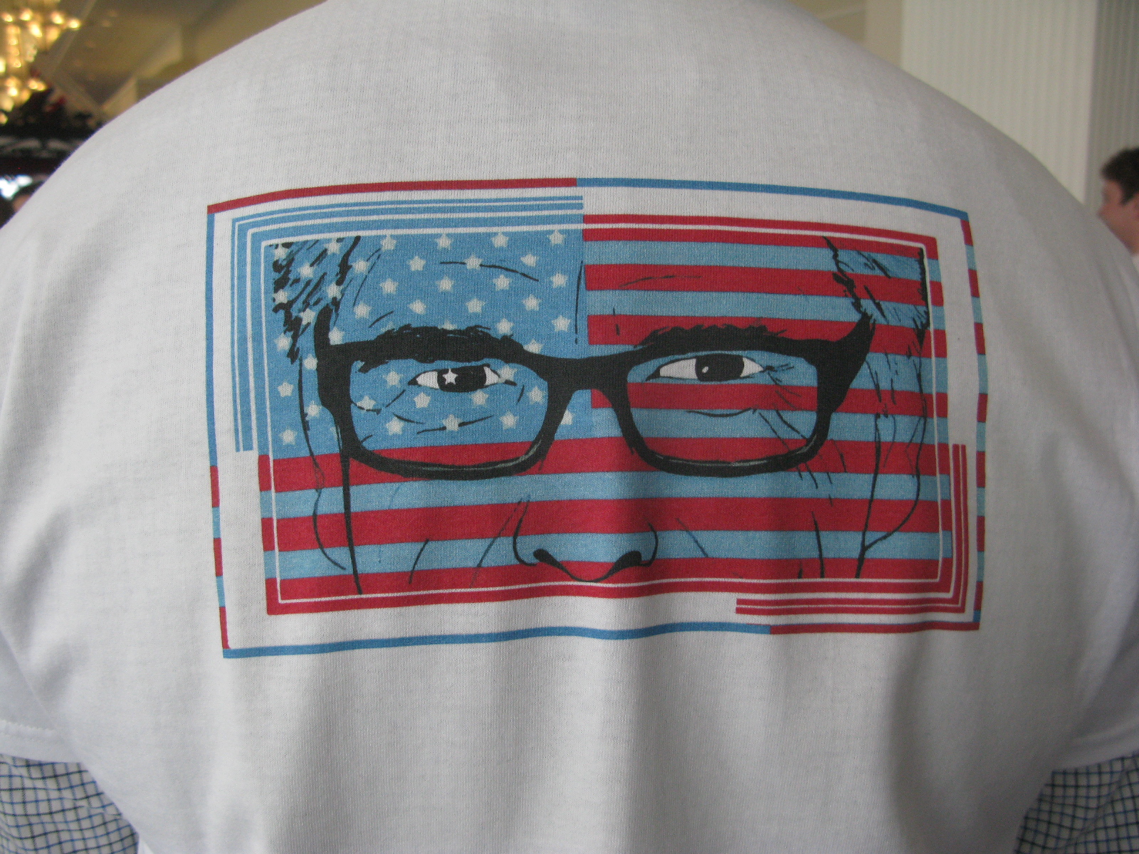
Guess who has a new campaign tee-shirt and logo …
Hint: it’s not Clark Kent.
Thank to Peg for the heads up.
Welcome to The World's Most Dangerous Beauty Salon, Inc.
My name is Susan DuQuesnay Bankston. I live in Richmond, Texas, in the heart of Tom DeLay's old district. It's nuttier than squirrel poop here.
I am honored and privileged to know Miss Juanita Jean Herownself, hairdresser extraordinary and political maven. Since she does not have time to fiddle with this internet stuff, I type her website for her and you can read it if you want to. If you don't, she truly does not give a big bear's butt.
A lot of what I post here has to do with local politics, but you probably have the same folks in your local government.
This ain't a blog. Blogs are way too trendy for me. This is a professional political organization.
Now that is just downright creepy.
1Isn’t that desecration of the flag?
2It does remind me of some one looking through the blinds…like a creepy peeping Tom.
3Big Brother is watching you.
4That’s very “Big Brother” of him. I know Perry probably never read Orwell, but you’d think someone on his campaign committee would have realized that is not the message you want to send.
5I especially like the artistic touch of putting one of the stars in his eye. I assume, it is probably the “Lone Star” by those creating the image.
So…he’s given up being known for his hair and now focuses on the glasses? What a jerk.
You really would think that somebody on the campaign would advise against this. But then again–if the stripes were vertical then we’d see the wisdom of projecting into his future.
6You know what they say about putting lipstick on a pig….
Gee, I wonder if Sarah will say that at CPAC.
7Just what we need, a fool trying to make it seem like glasses are enough to make a person not only see better, but think better. While, in a just and righteous world, FDR *should* have been able to use his wheelchair as a symbol of his perseverance, in his campaign ads, Gov. Perry just can’t do it. He may, finally, be able to count to 3, but glasses only work as well as the eyes using them; “Oops!”…
Still freezing near Beantown 🙂
8Looks like an old man spying on you. Is this the NSA’s new recruitment poster? Rick Perry, the new face of the NSA.
9i’m ready to vote. Glasses will let me see the future. Ophthalmologists will be elevated to the over seers class.
10Looks like he is looking out from behind prison bars. A good look for him.
11During the 1988 Democratic Convention, a palette of soft red, white and blue colors was used as a backdrop. The Republicans lashed out with comments such as “soft on issues” and “wishy-washy.”
Perry’s blue looks pretty pastel to me, and if he’s trying to stay inside the lines while coloring, I might also point out that the stripes should be white.
Somebody needs a new prescription.
12Unfortunately, there is not one thing that anything, (including a T-shirt) can do…. to make this man look like anything more than what he actually is….. which is DUMB, DUMB, DUMB. jmho
13Looks like he is incarcerated.
14This is the only thing that came to my mind:
OH, FOR GOD’S SAKE!!
I simply cannot get any more clever then that!! These morons simply suck the funny and clever right out of me!!
15I’ll bet someone’s already doing a T-shirt which replaces the “human” face with that of a lipstick-wearing pig with identical glasses.
16And when you’re putting lipstick on a pig, it helps if it’s at least the right end of the pig.
17Well that’s just creepy.
18Peepin’ Rick.
19The nose is bothering me. Well, to be fair it’s not bothering me more over all than he does.
20Keep the funnies coming,gang. I’m having fun chortling at your cleverness mixed with the truth. 🙂 🙂 🙂 Smileys for everyone today!
21Anybody walking around wearing that shirt better be prepared to get pelted. It’s better than a bull’s eye. It’s a pRick eye.
22Graphic design fail. The position of the nose over that bottom stripe makes it look as if pRicky is a voyeur looking over your fence or in your bedroom window. I suppose this is what you get when you don’t pay top dollar for an experienced political designer.
23Is that an effort to make his voters smarter?
It’s not working, they have insufficient memory to run more than Windows 98 ME….
24Oh, how cool…. Clark Kent looking thru Venetian Blinds. Special.
25I have some doubt that the t-shirt with logo is the work of Perry, or his campaign aides. It looks more like the work of Colbert or John Stewart. Don’t get me wrong, I hope it is Perry’s work. As dumb as he his surely he is not dumb enough to come up with, or even allow, the use of such a logo. We shall see.
26Well, I guess I should have read the linked article before spouting off as I did. So, it is now affirmed for the whole world to see just how dumb and dumber Rick Perry is.
27Rick the Dick!!
28I don’t get why plain black-framed glasses are “hipster” glasses.
Shades, now, that might make it, but those? Old White Man glasses.
29Actually they look more like Woody Allen glasses. And if truth be told, I can’t help thinking it looks like the sign in the “Great Gatsby”.
30Why are the flag’s stripes blue?
31I now have Sting’s “Every breath you take” going in my head.
32Poor Rick seems to be a cross between Don Quixote and Chicken Little. With glasses.
33All I can think of is voyeurism! And a rabbi around here is going to jail for just that! Must now go take a shower.
34That is Perry’s consolation prize for being out of the 2016 Potus race before anyone else. All I got was this lousy T-shirt.
35Unfortunately, there are some people who will fall for even this.
36That shirt is so completely awful and creepy that it is almost like someone tricked him into using it. You know the type. Some genuine “progressive,” likely a “designer” (you know what I mean) who was laughing up his sleeve as pRick
37stood in front of a mirror thinking to himself “should I? shouldn’t I?” After all he is a man, a “real” man in Texas! He can’t be expected to know from fashion . . .
Blue stripes are art. or blinds where he peaks through. dunno.
38Does anyone actually know what pRick was shooting for with this? It has stirred quite a bit of conversation. From that point it is a good ad. I say that in the sense of giving Satan his due.
39I sort of get the red, white and blue motif, but why such a sissy blue?
40Are you sure that’s not an anti-Perry shirt?
41Isn’t that the same shade of blue in Shepard Fairey’s Obama Hope poster?
42